
RYZE Coffee Wheatpaste Campaign NYC
500 wheatpaste posters (24x36) across Brooklyn and Manhattan. RYZE mushroom coffee posters hit high-foot-traffic walls. Every placement GPS-tagged and photo-documented.
- Placements500
- Cities1
- Duration21d
- Documented31install photos on file
Mornings start on the corner.
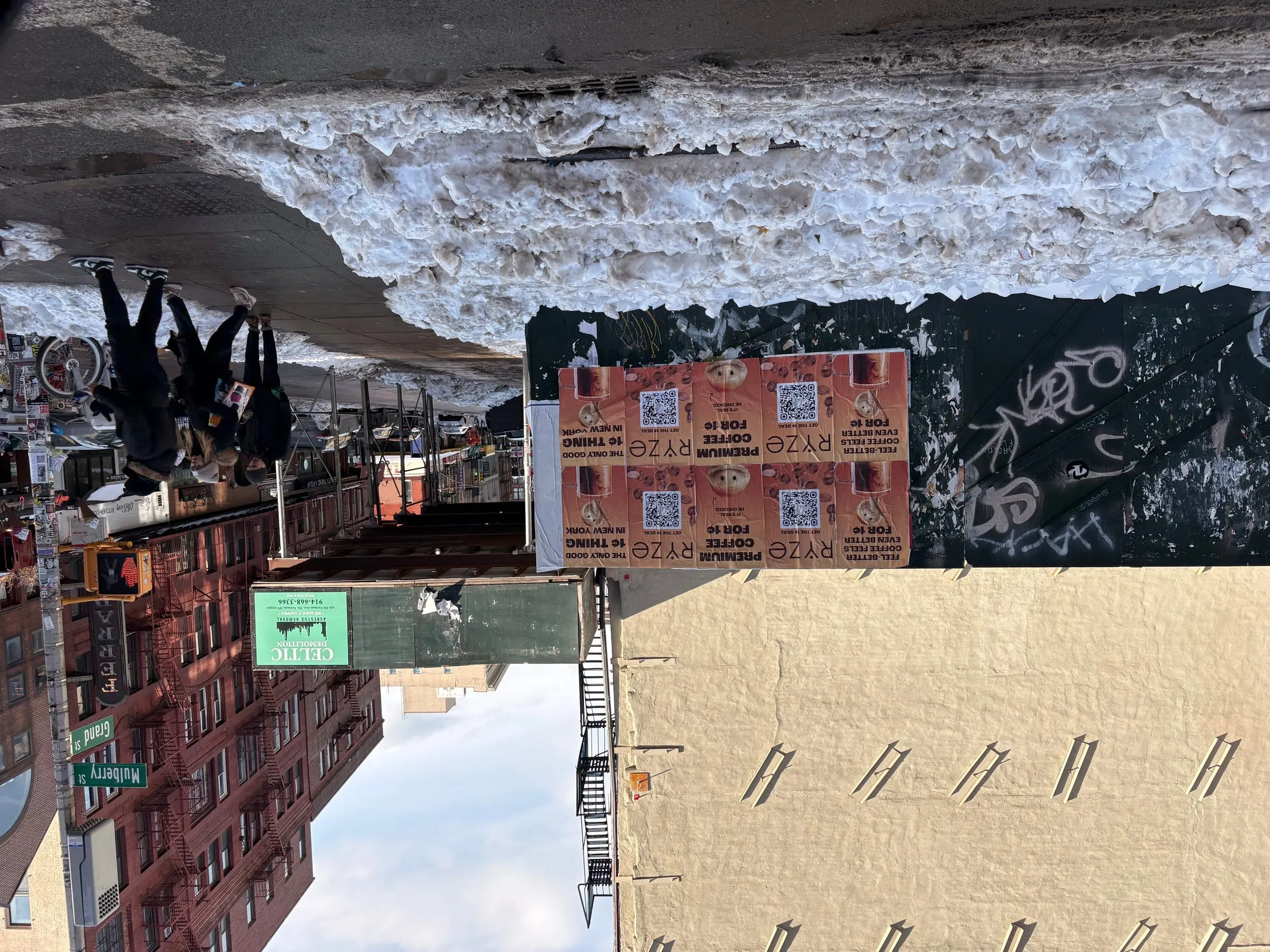
RYZE mushroom coffee wheatpaste campaign in NYC. 500 posters (24x36) across Brooklyn and Manhattan targeting morning commuters. GPS-documented.
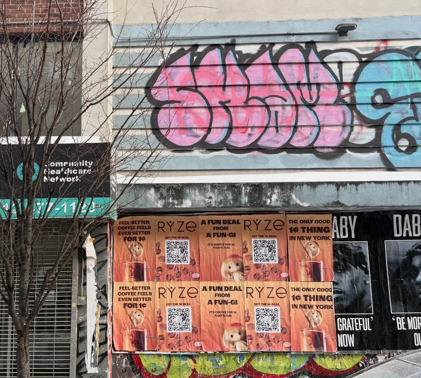
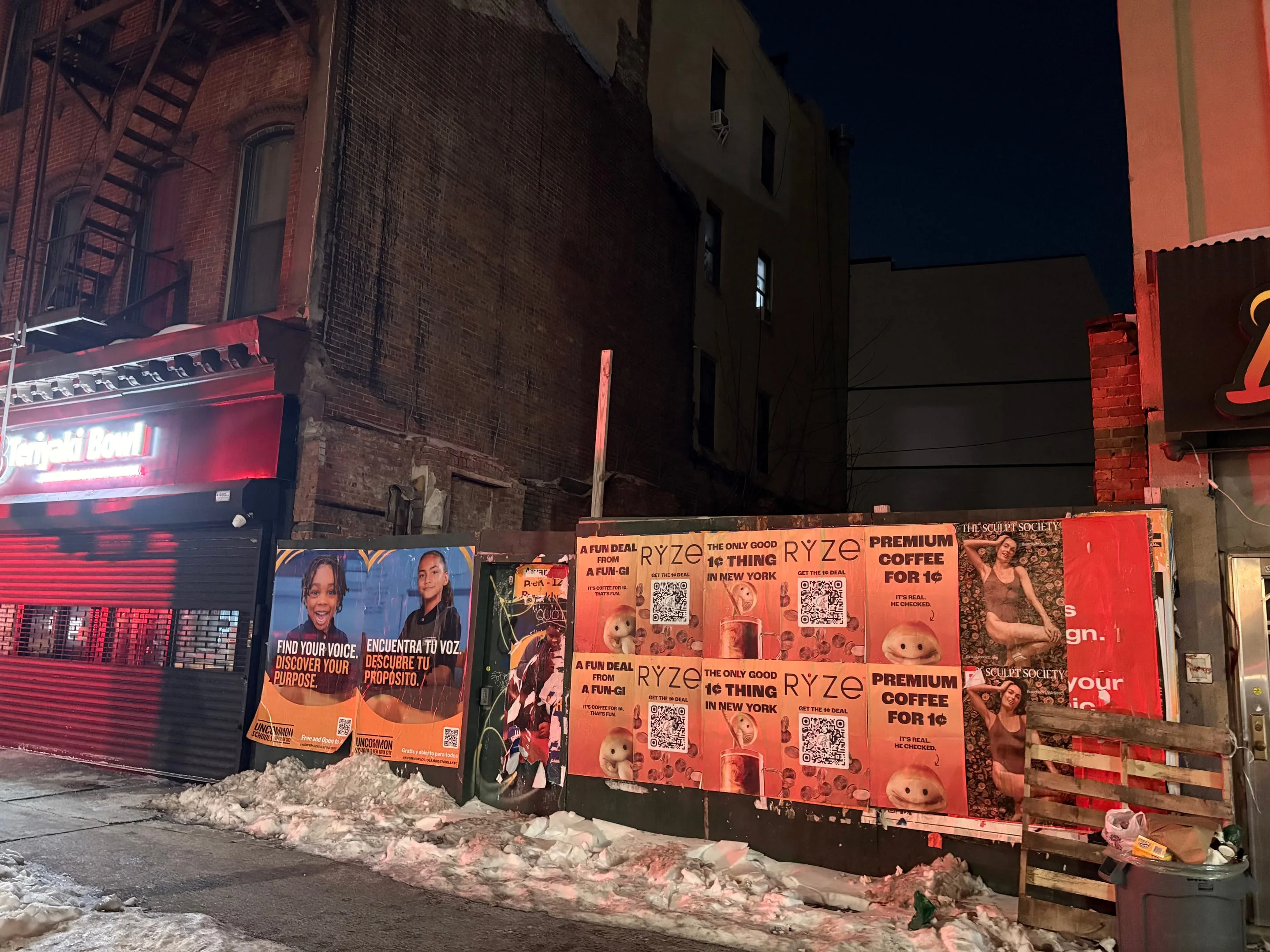
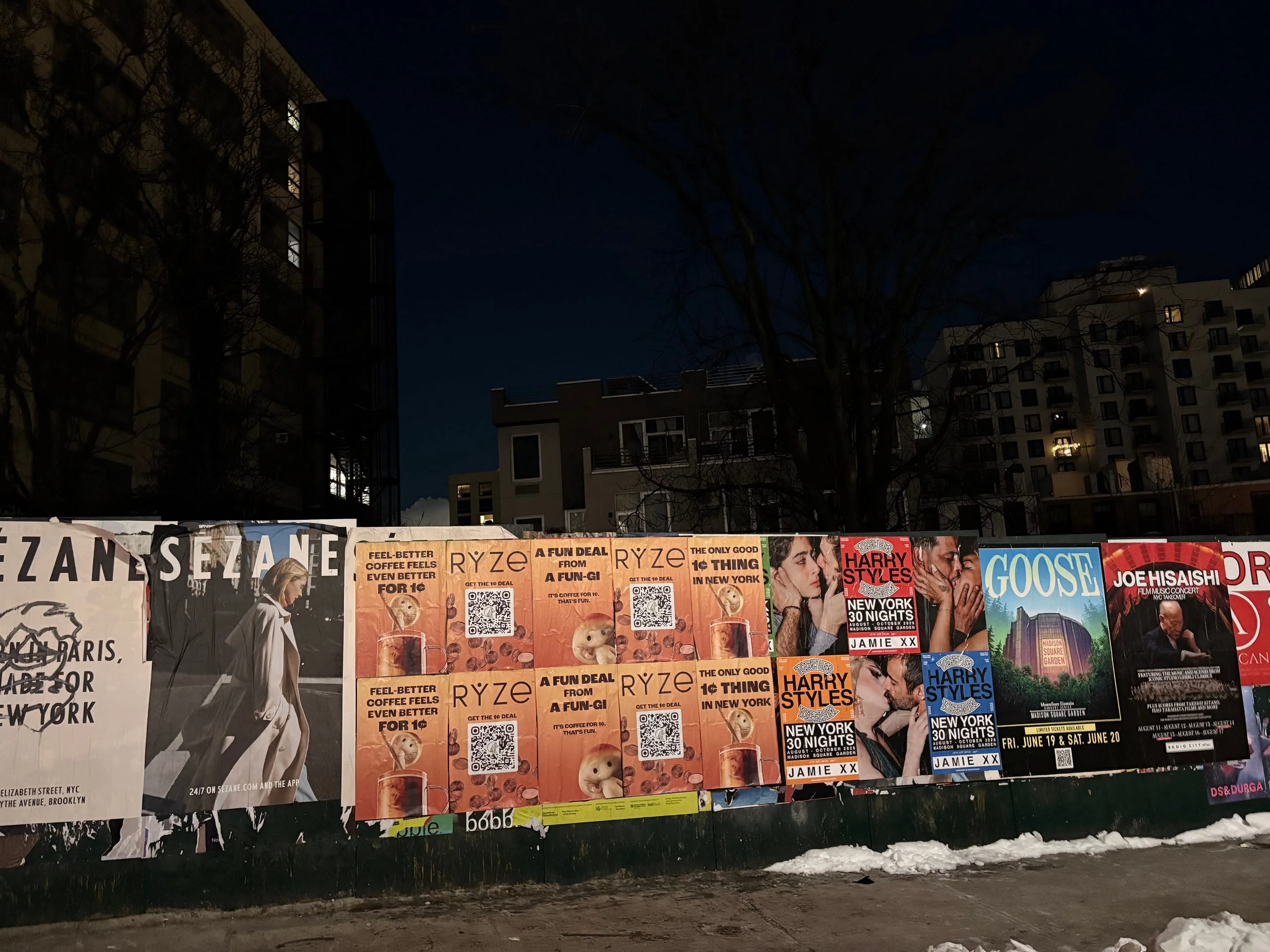
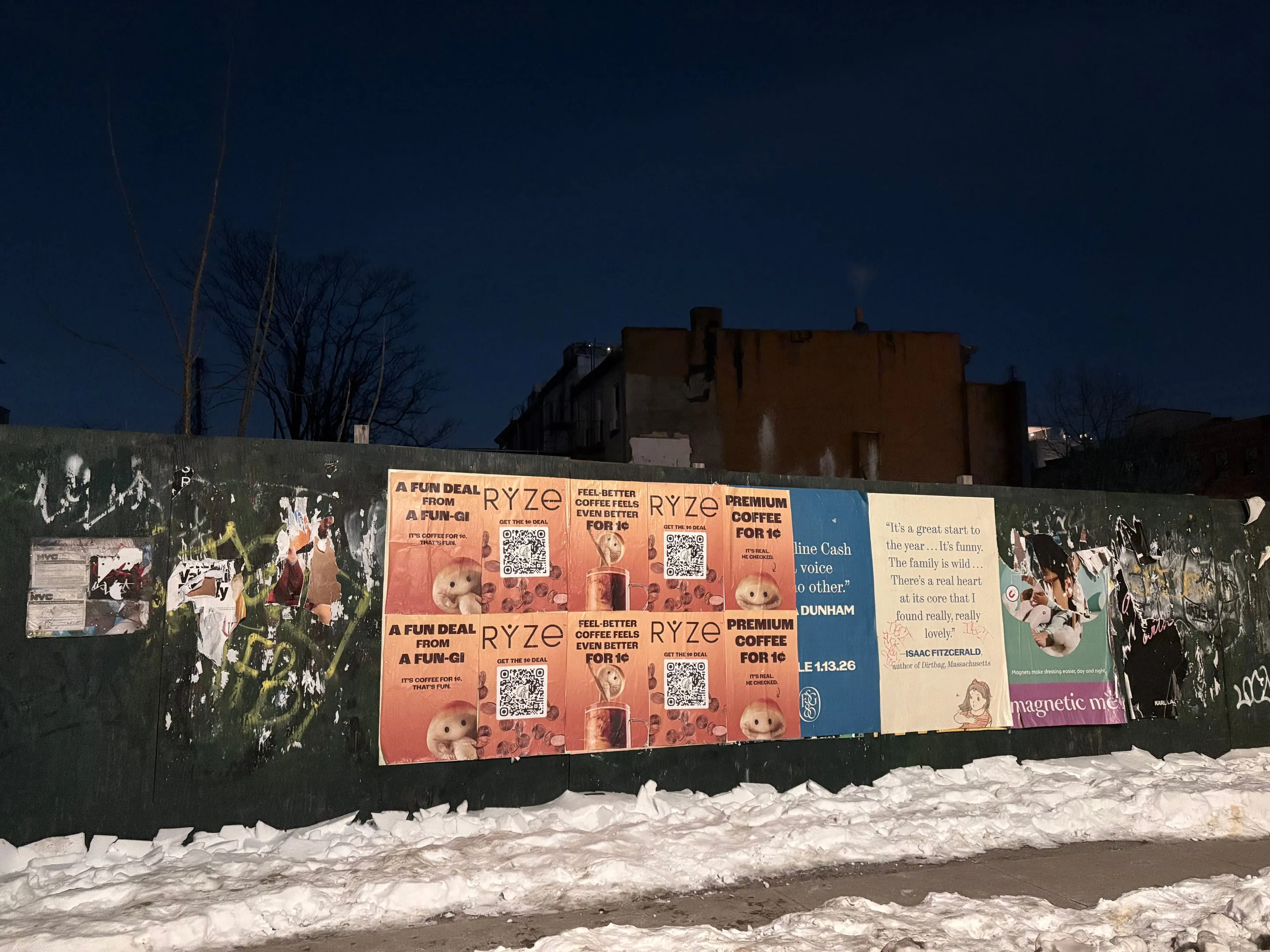
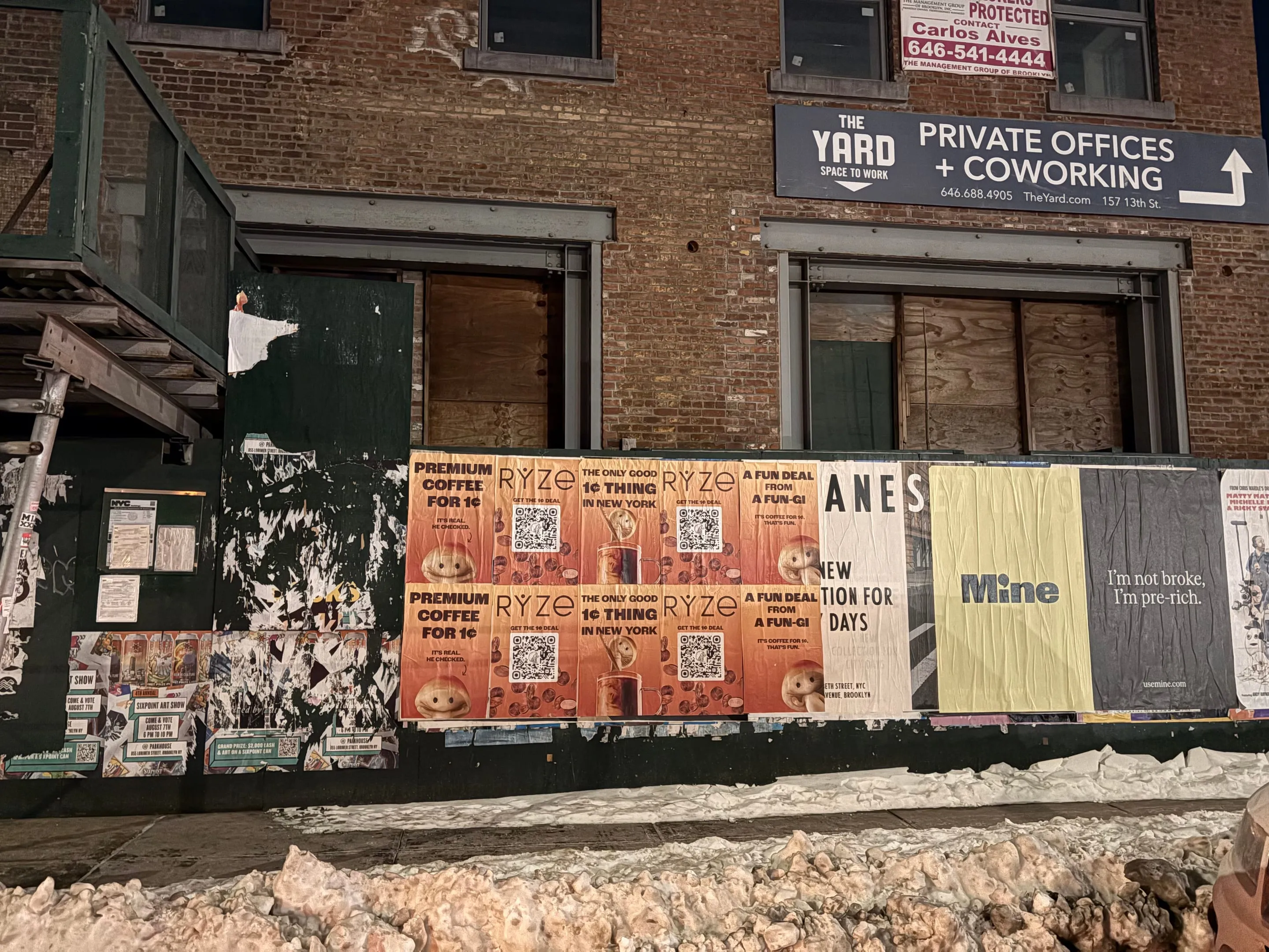
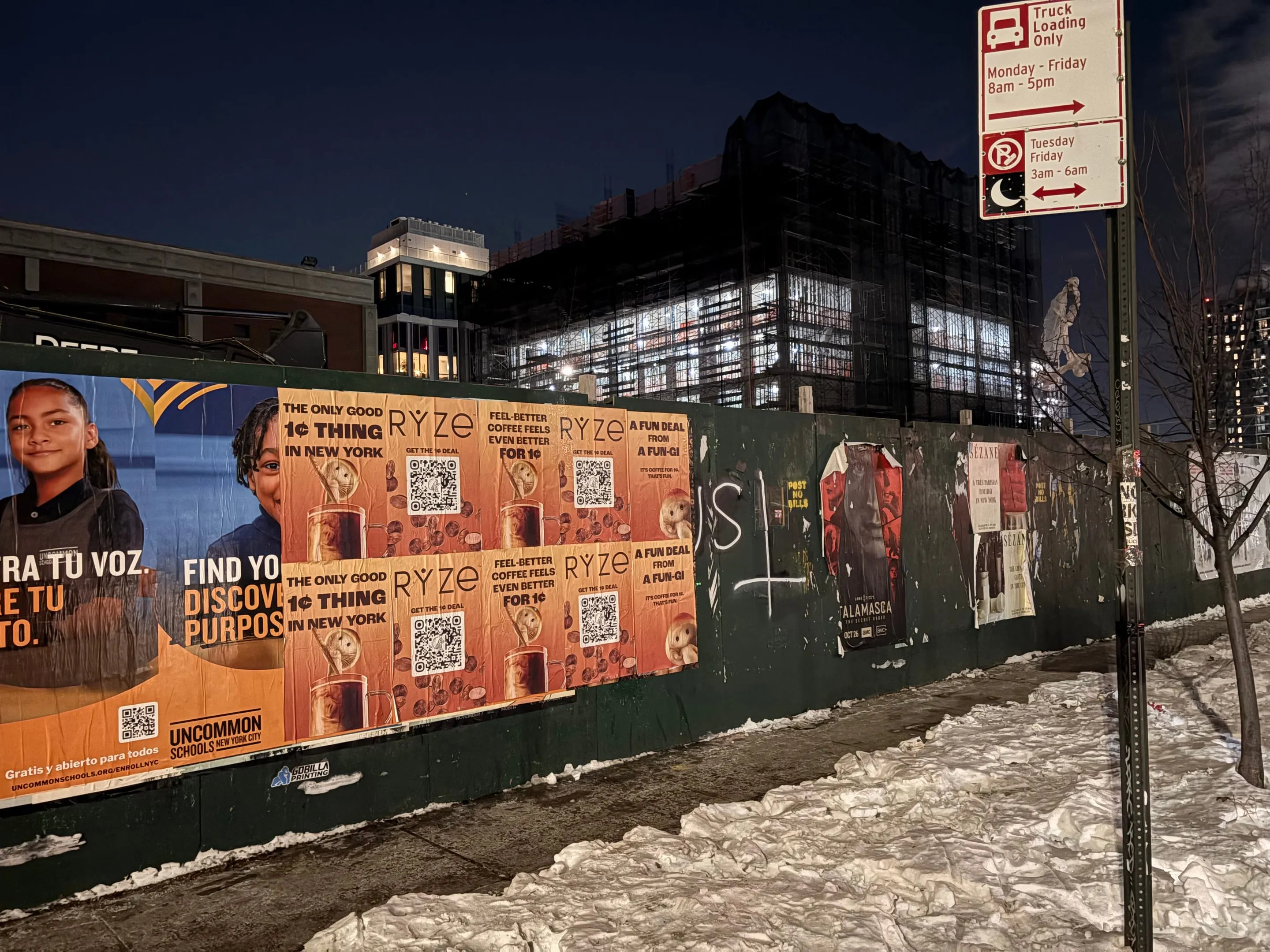
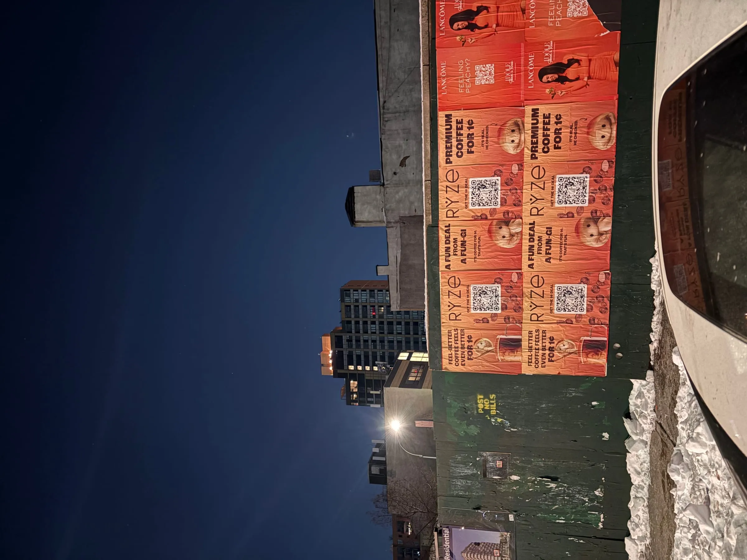
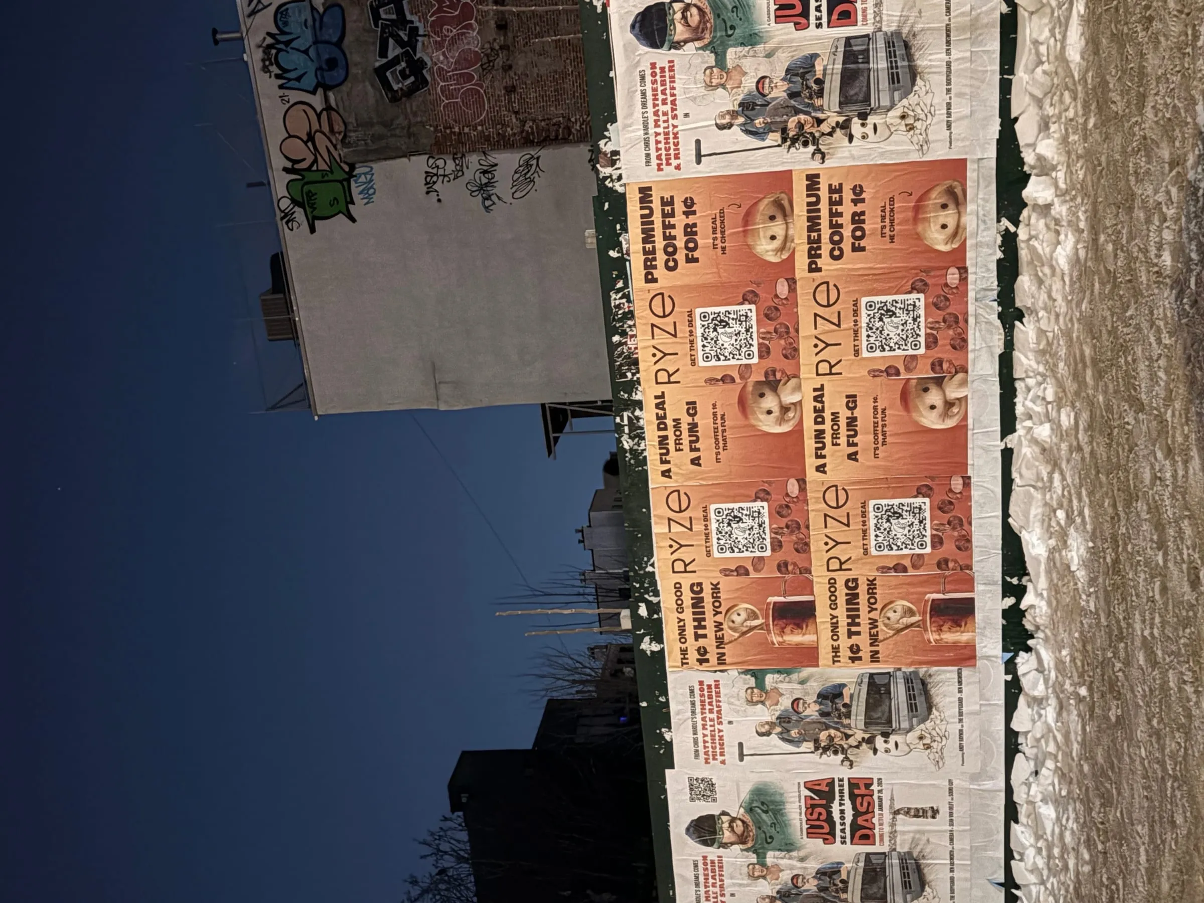
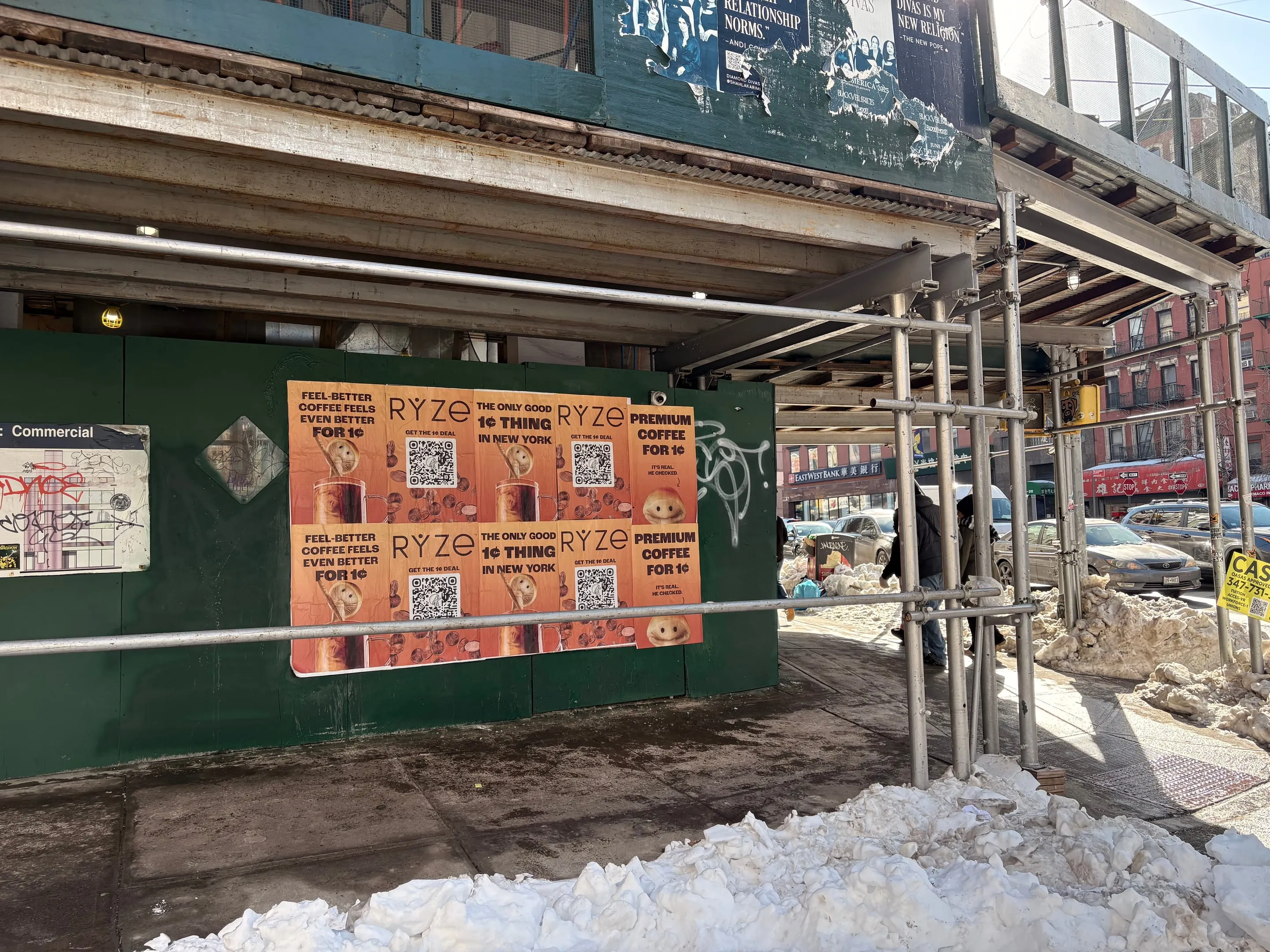
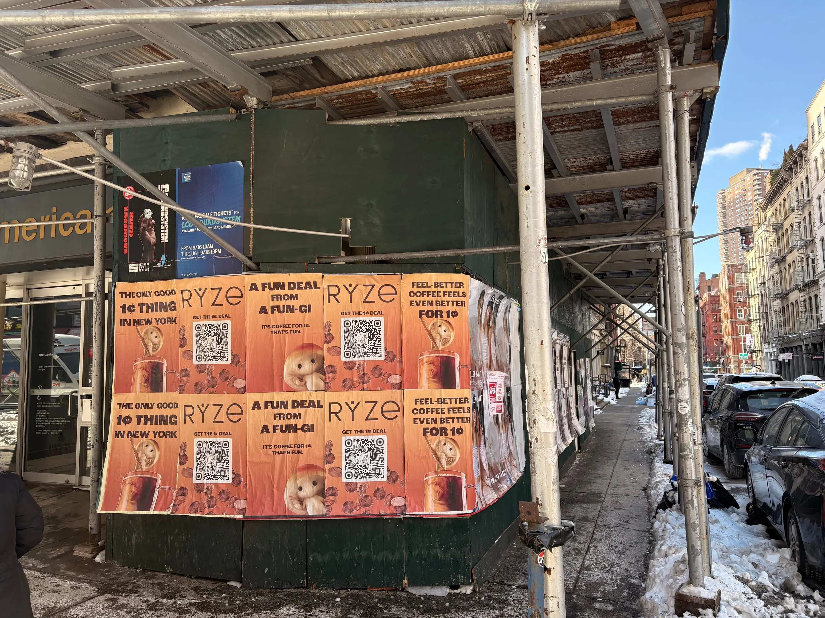
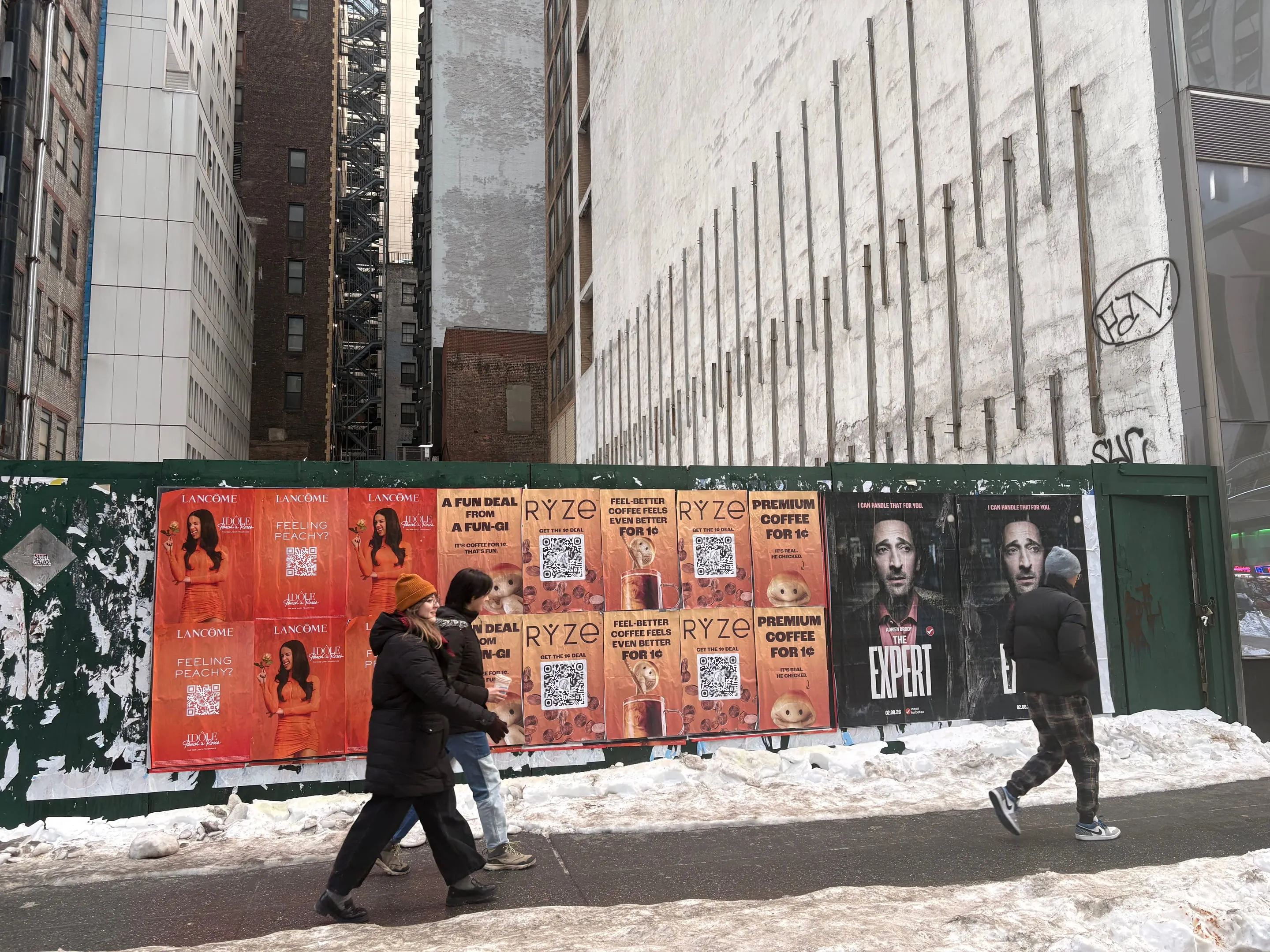
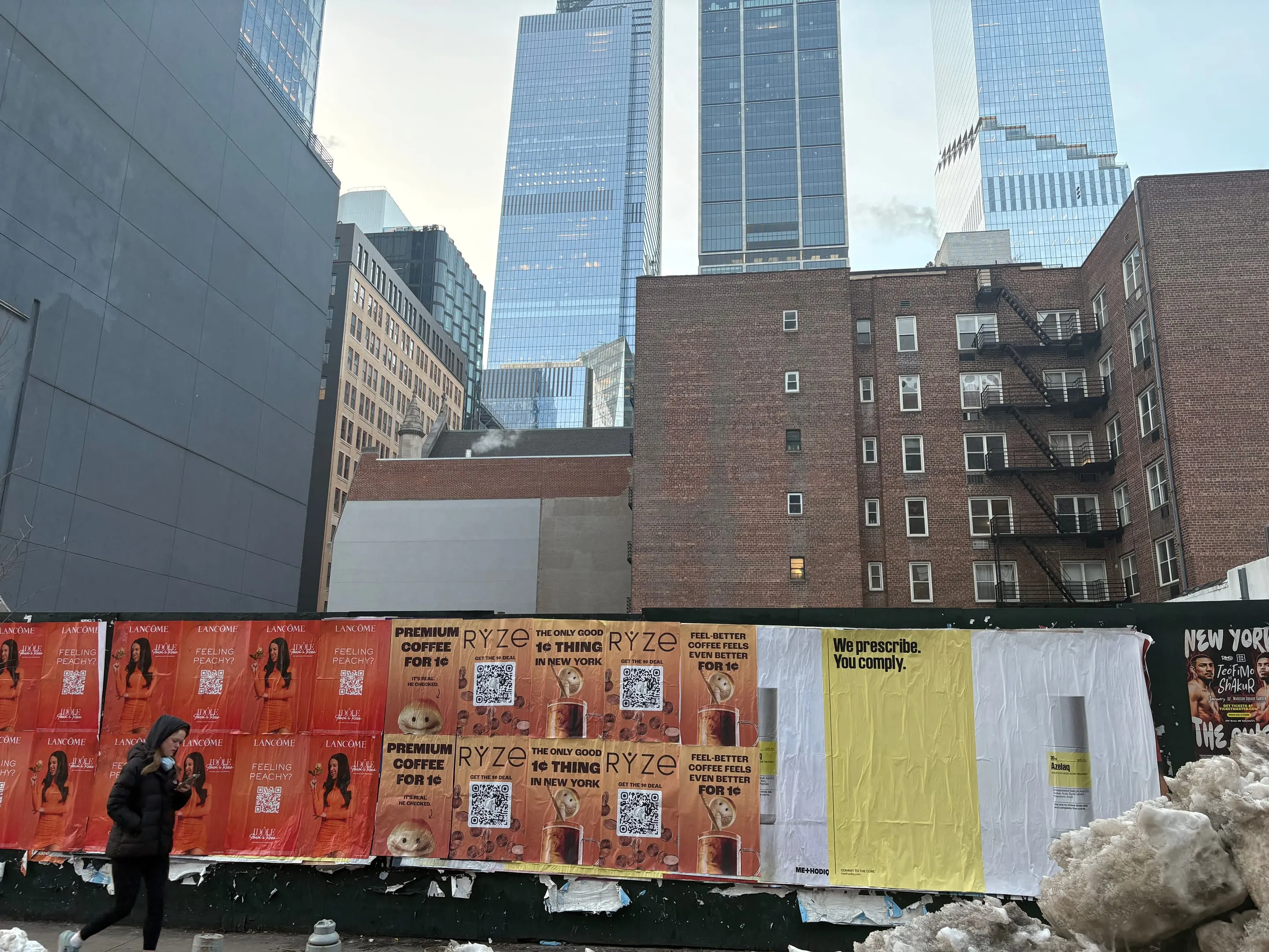
The product is emerging category, functional coffee with real differentiation. The message needed walls where people already move: subway corridors, high-street intersections, coffee-shop adjacencies. RYZE is built on humor and credibility. The posters had to work both. Copy hit the category tension: "The only good 1¢ thing in New York." "A Fun Deal from a Fun-Gi." "Feel-better coffee feels even better for 1¢." Three variations. Orange branding. Consistent sizing. Target: coffee culture nodes where morning foot traffic peaks at 7–9 AM and holds through lunch.
The problem was specificity. RYZE doesn't go on every wall. It goes on walls where coffee drinkers walk, near subway exits that feed toward offices, near existing coffee shops, near fitness studios and gyms where the performance angle sticks. The deployment is as important as the creative.
Where we ran it.
SoHo traffic is upscale and affluent. RYZE's price-to-performance claim works there.
Williamsburg ran through the North Side commercial district. Metropolitan Avenue, Bedford Avenue corridor, and the blocks feeding toward the L Train platform. Williamsburg commuters are younger, performance-focused, early-adopter demographic. Functional foods thread through the neighborhood's natural products stores and fitness culture.
Bushwick took the southern edges where residential foot traffic concentrates toward commercial blocks. Myrtle Avenue nodes, Jefferson Street junctions, and the intersections feeding toward the G Train. Bushwick's morning commute sees price-conscious coffee buyers stacking on top of creative-class workers grabbing cold brew.
The three neighborhoods split the NYC market vertically: luxury (SoHo), trend-forward (Williamsburg), volume (Bushwick). Same product. Different walls. Different audience calibration. 500 posters total across Brooklyn and Manhattan.
Wheatpaste advertising.
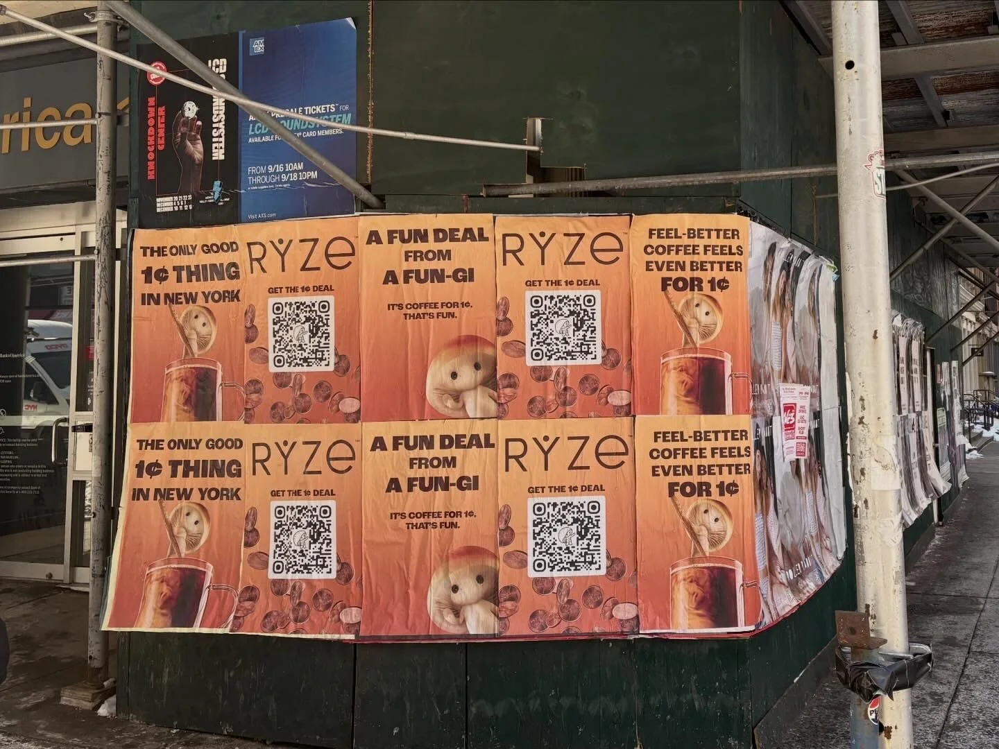
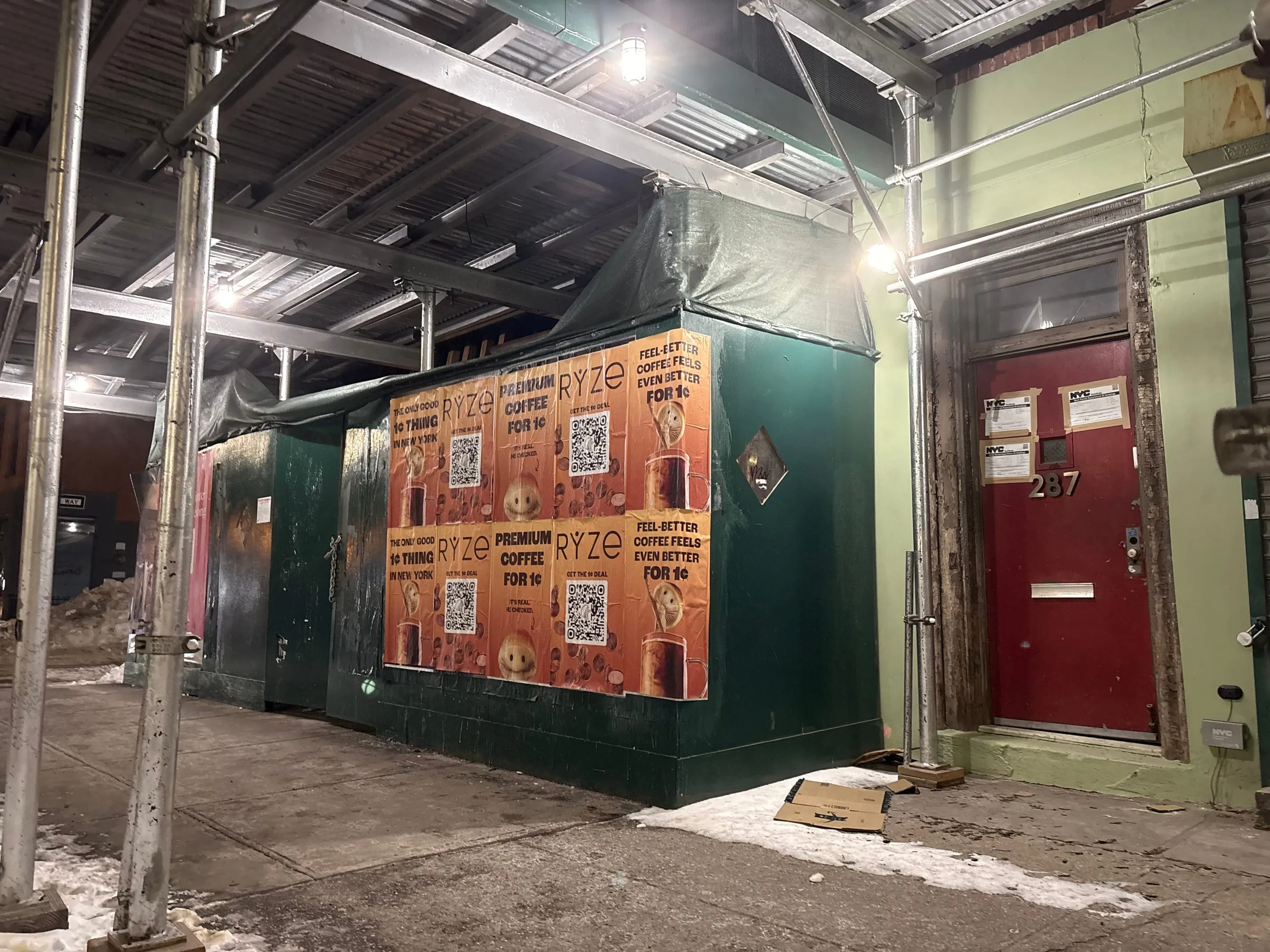
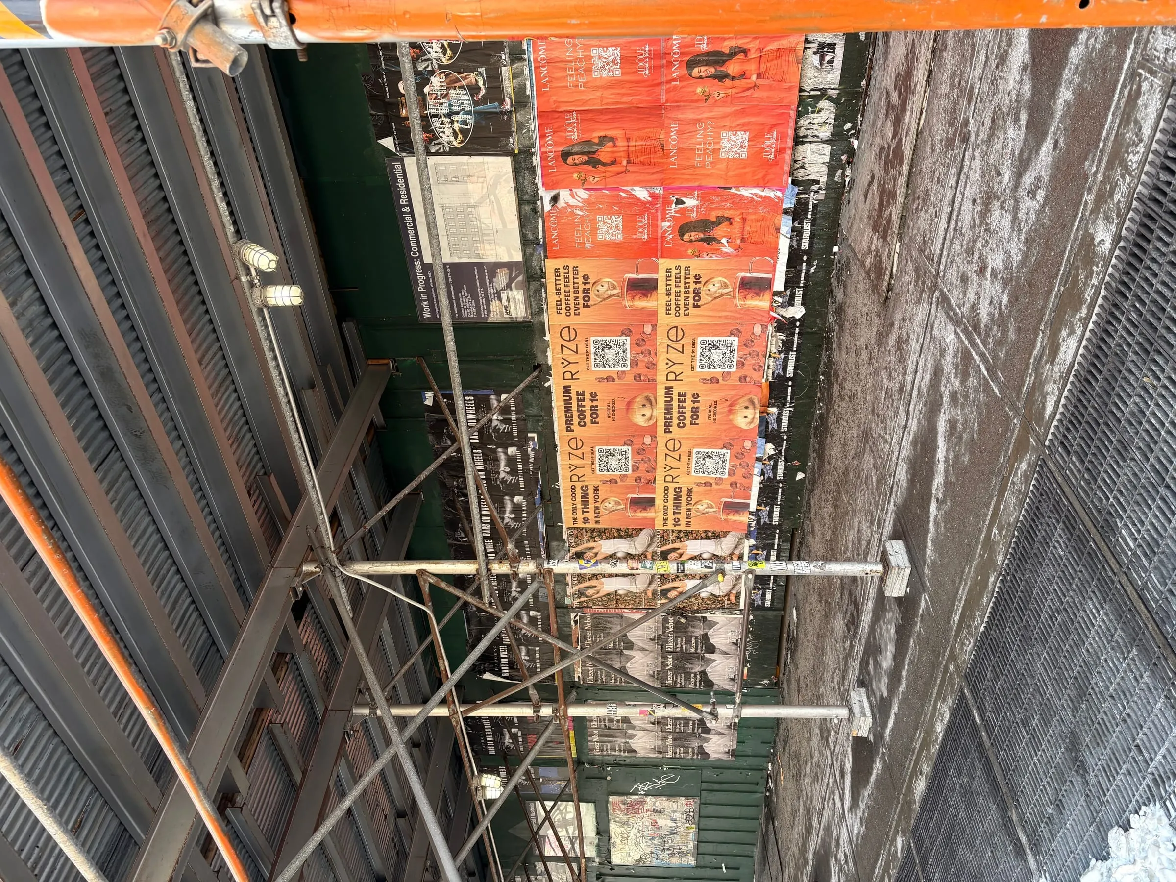
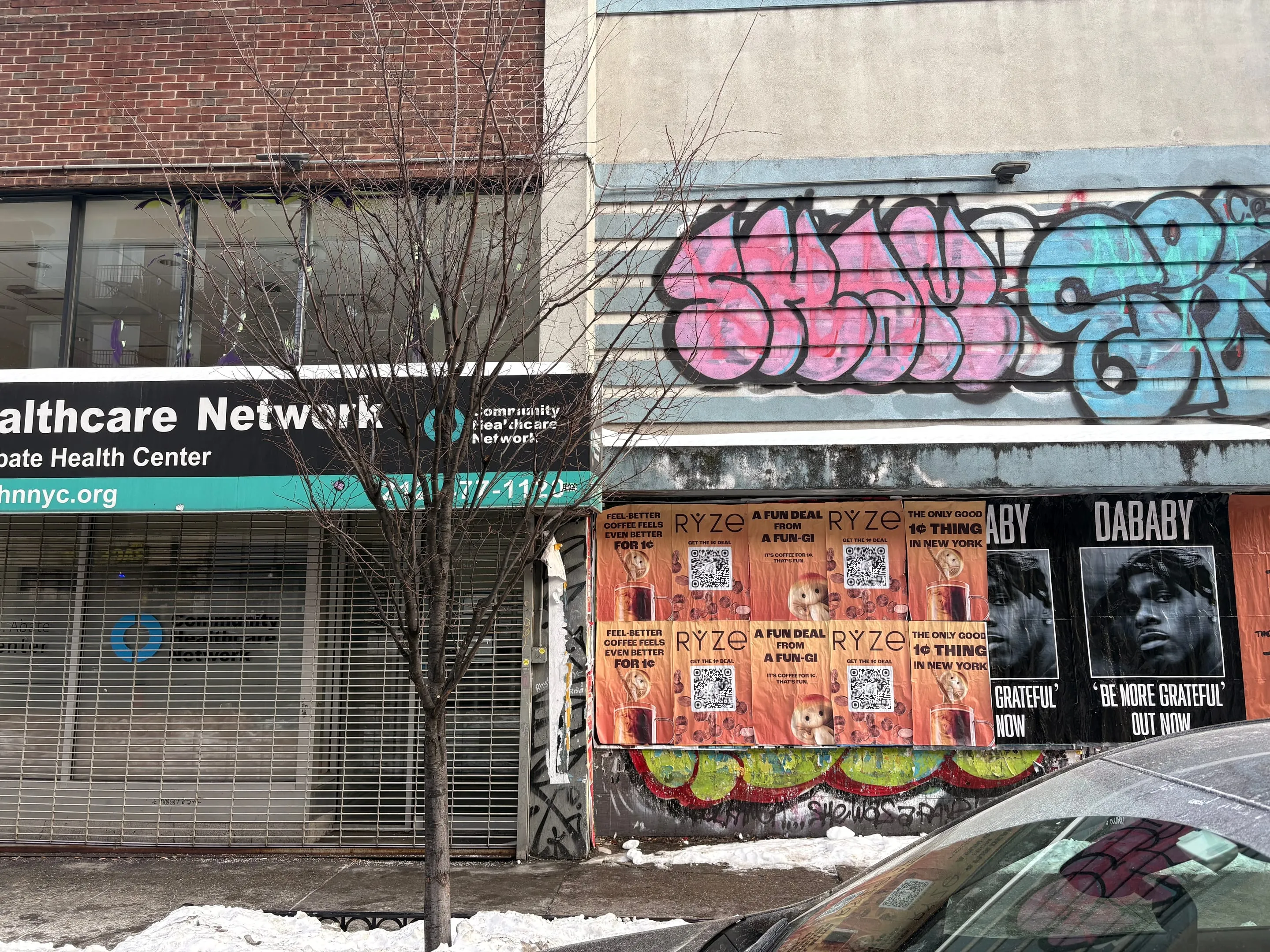
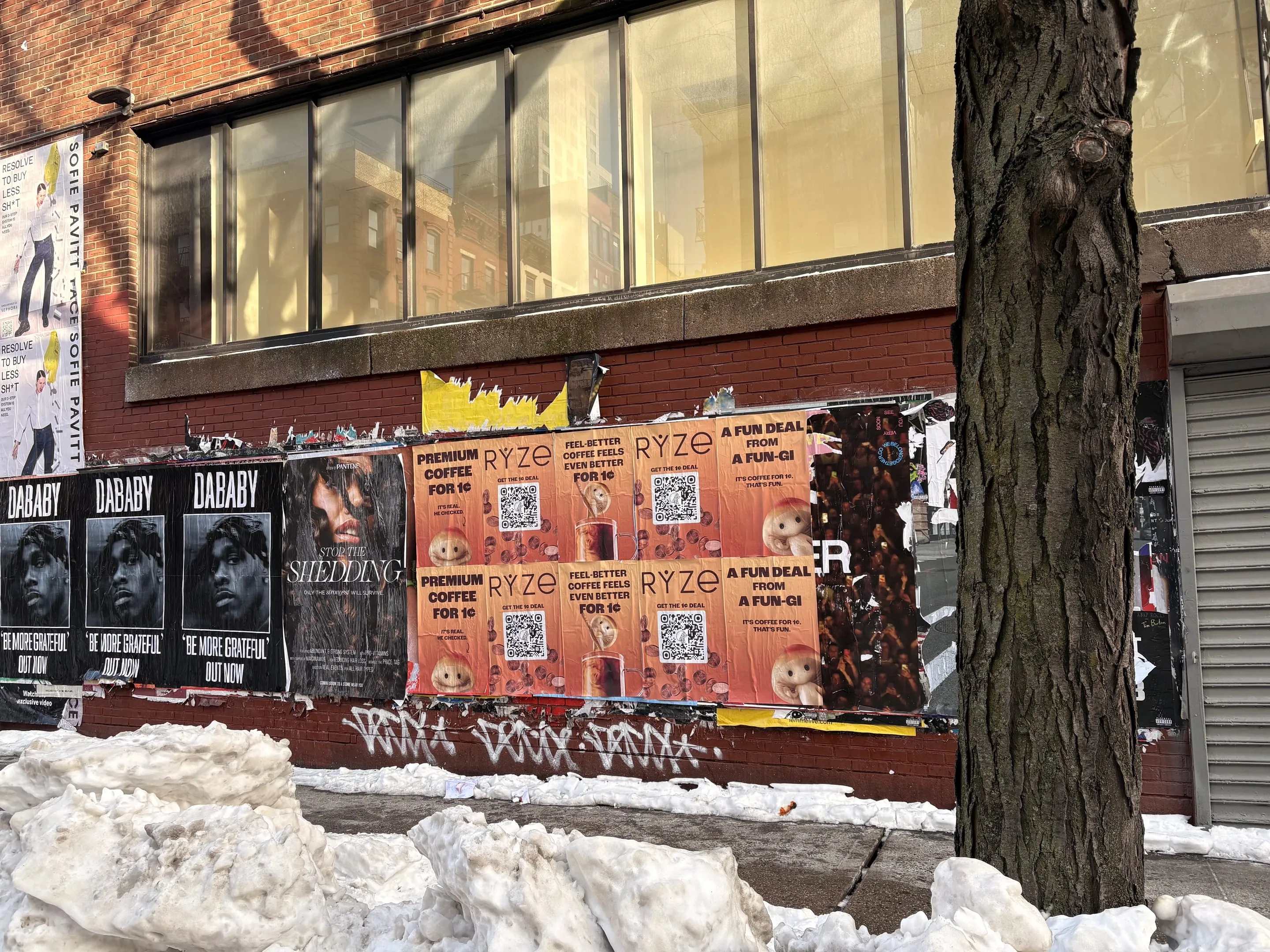
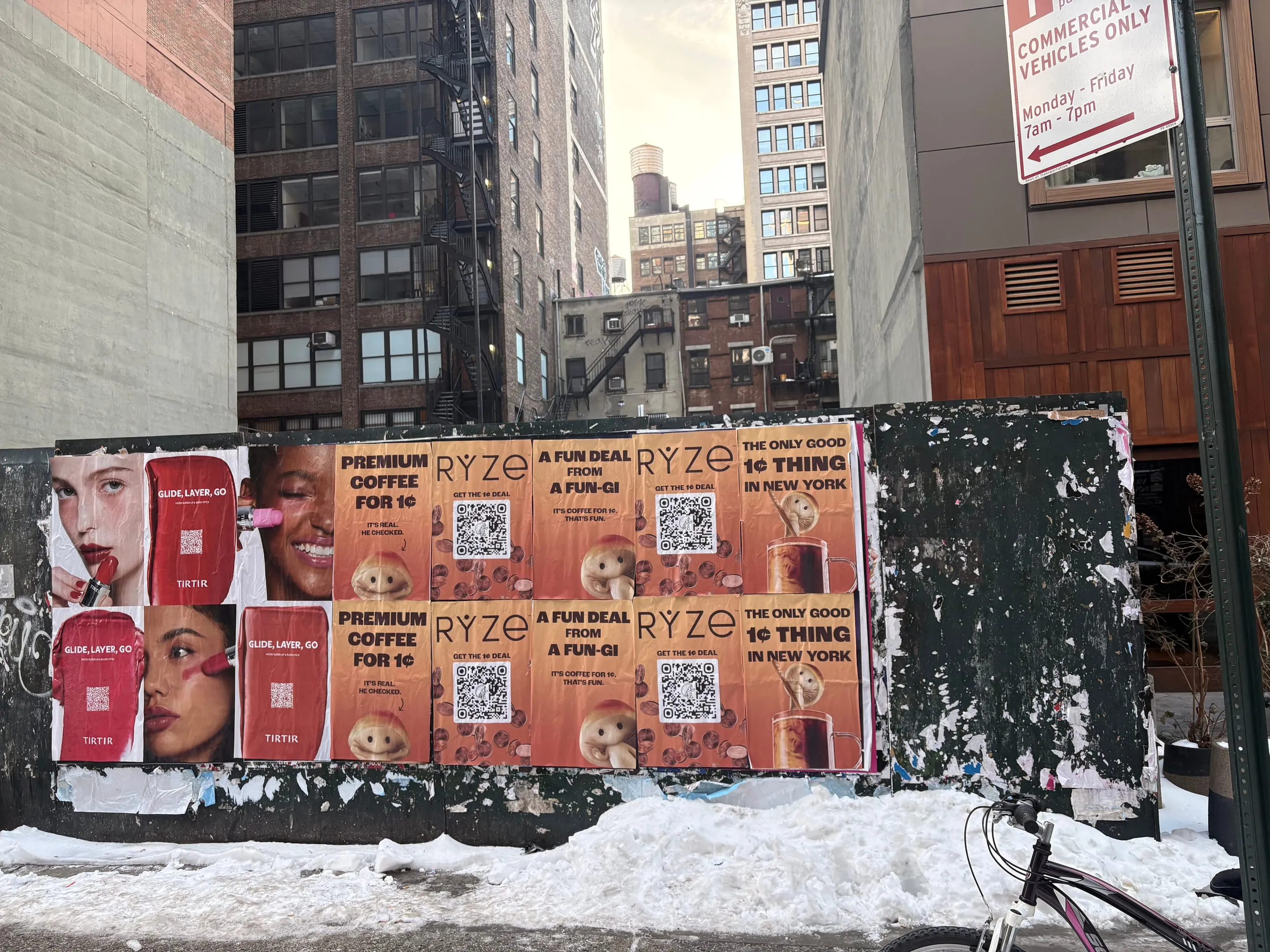
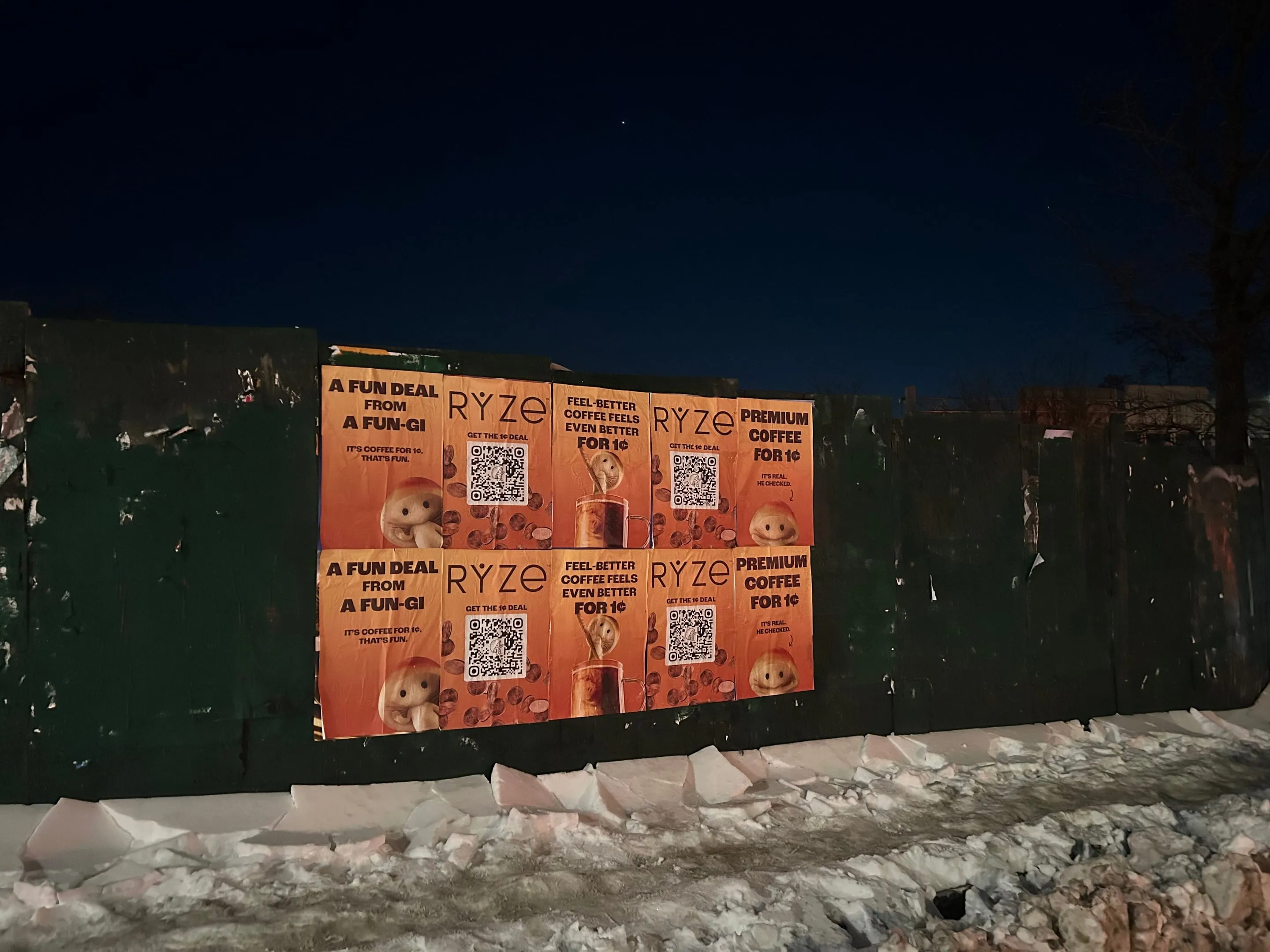
Full-color separation. 24" × 36" format. Three creative variations cycling across neighborhoods. Orange hex locked in all placements. Gloss finish to hold color and weather UV. Wheat-based adhesive mixed on-site for consistency. One installation crew, five days in-field, parallel coverage across all three neighborhoods.
How it played.
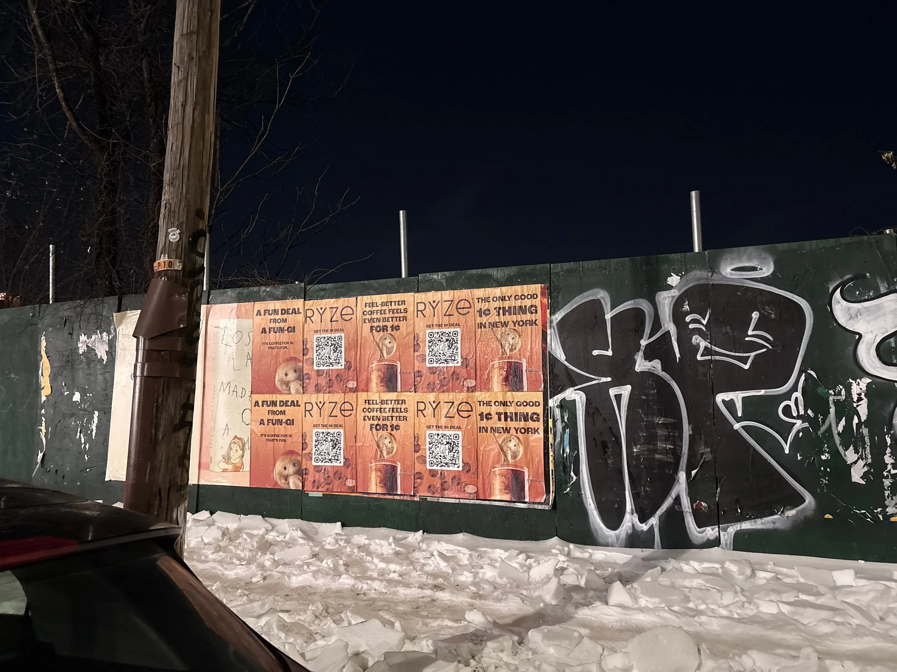
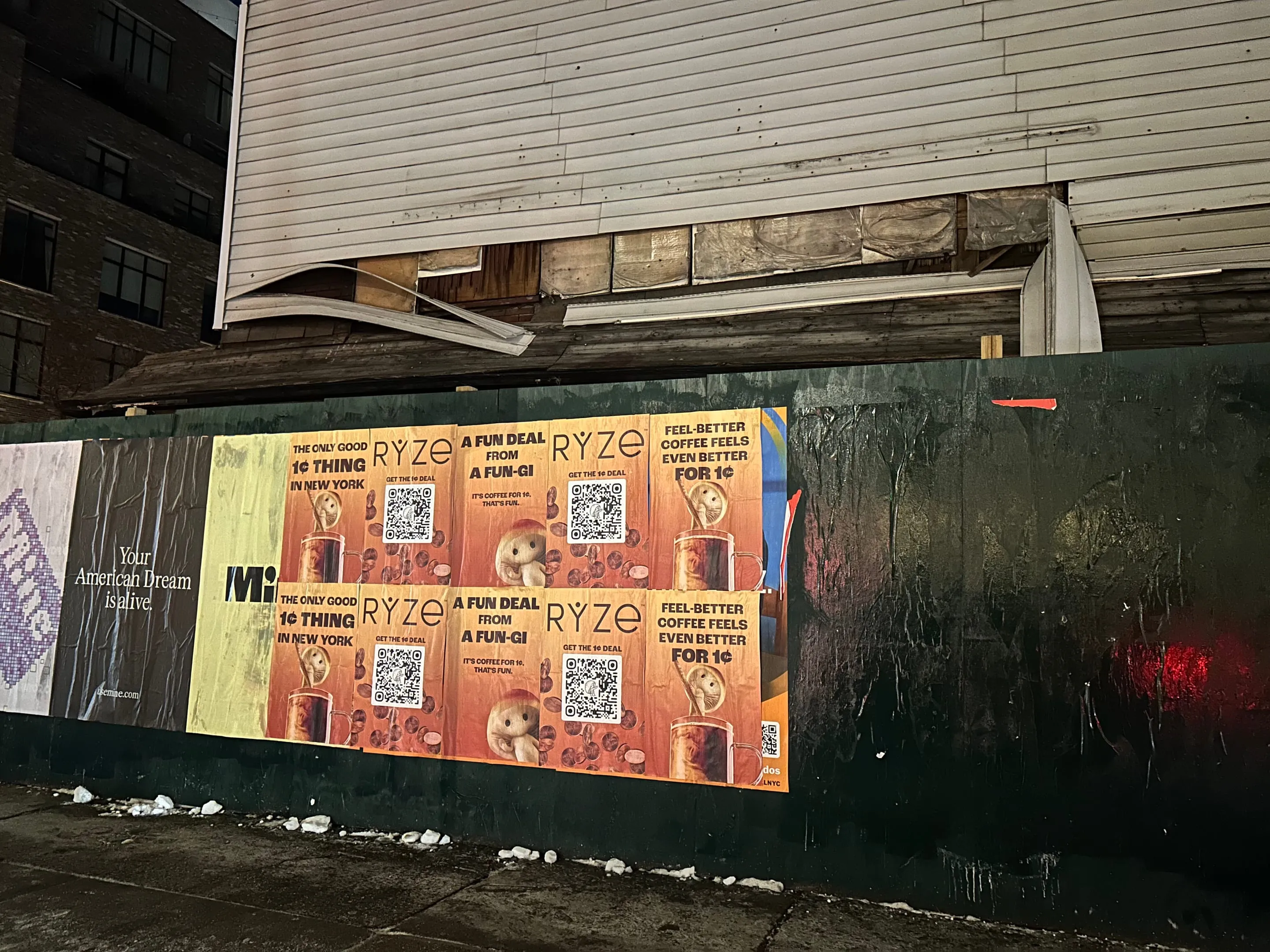
Walls were pre-surveyed in batches. Some were fresh blank surfaces, ideal for wheatpaste adhesion. Others had partial paint coverage from previous campaigns, acceptable paste substrate, rougher finish actually helps the adhesive key. Storefronts with interior glass backing got skipped. Timing was locked to late evening (7 PM–11 PM) when foot traffic bottomed and the adhesive had 12+ hours to cure before morning commute reset.
Day 3–4: Williamsburg escalation. The crew moved north across the Williamsburg Bridge corridor. Bedford Avenue's morning foot traffic is dense, 6:30 AM first wave, second surge at 8:30 AM. The crew had to finish north of the L Train by 5 AM to catch pre-commute adjacency. Several walls were positioned directly above street-level coffee shops. One placement went on a gym's exterior wall (Life Time Fitness). the adjacency is intentional. Commuters exiting the gym catch RYZE at the moment when their post-workout state overlaps with the coffee impulse.
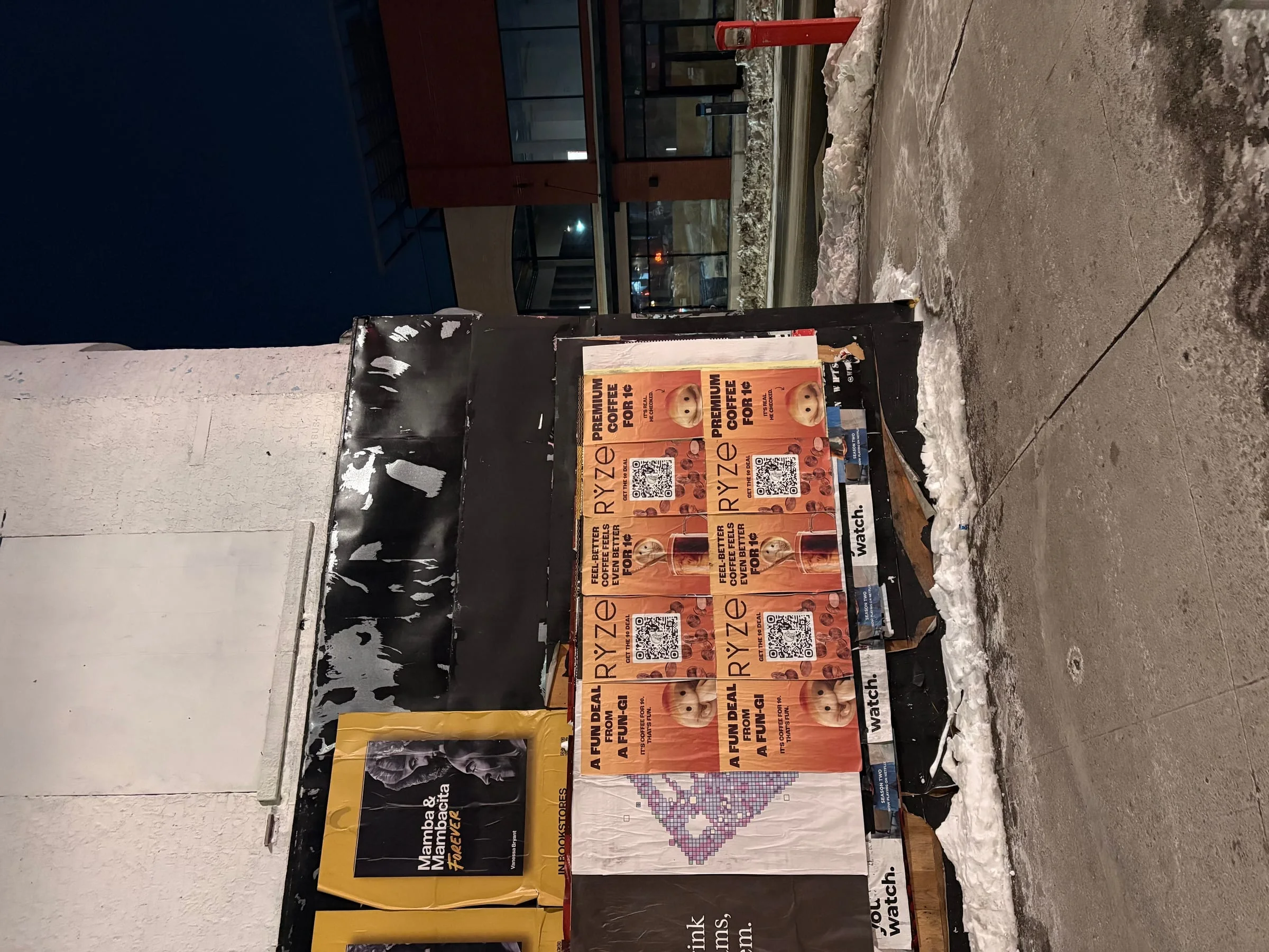
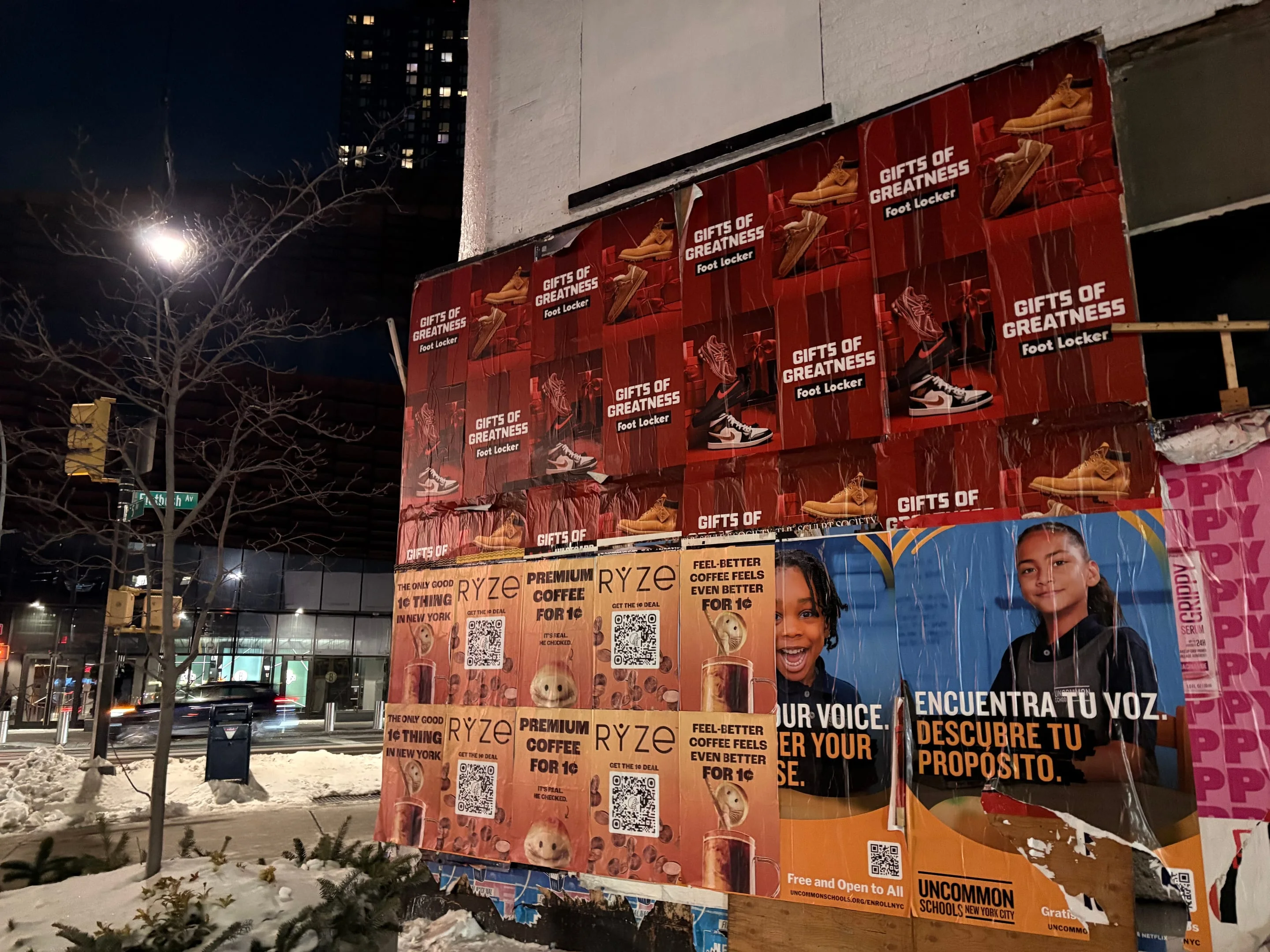
Day 5: Bushwick saturation. Placements ran across Myrtle Avenue and the south-side commercial blocks. Bushwick's walls carry more existing paste layers, decades of campaigns settled into the brick. The surface texture is actually desirable for wheatpaste work. Older paste creates micro-keying that newer adhesive grabs into. One wall had active competing signage (commercial A-frame sandwich board) positioned directly beneath. The crew hung RYZE two feet above the sign, high enough to be visible from across the street, low enough to read at 20 feet. The sandwich board became an accidental secondary audience marker. If you see the coffee sign, RYZE is above it.
Weather held dry for all five days. Wheatpaste cures fastest in stable humidity and moderate temp (55–65°F). The May NYC weather cooperated. No rain holds. No wind damage. Full adhesion across all 500 placements by day six.
500 surfaces documented.
Each wall photographed post-install. No filter. Straight daylight geometry. GPS coordinates locked for all 500. Crew submitted real-time timestamp photos (phone timestamp visible, no post-production). The documentation chain is unbroken: location + date + time + coordinate.
The proof isn't the impression estimate. It's the photograph. It's the GPS file. It's the coordinate you can paste into Google Maps and see the actual wall the poster occupied.
Three variations rotated across neighborhoods. SoHo saw "1¢ thing" copy. Williamsburg got the "Fun-Gi" version. Bushwick mixed all three, with the majority hitting the "feels even better" angle. Copy rotation wasn't random, it was calibrated per neighborhood demographic. Bushwick's version leans on the price-to-value read. SoHo gets the luxury angle. Williamsburg gets the performance-supplement positioning.
Photo proof captured creative consistency. Same orange. Same type scale. Same clearance from building edges. Variation was intentional, not sloppy. A client reviewing the GPS log and the photo set sees exactly what deployed, exactly where, and exactly when.
Notes.
The timing worked. SoHo's affluent commuters were already searching for performance-upgrade coffee. Williamsburg's early adopters were already buying. Bushwick's price-sensitive audience saw the 1¢ copy as permission to try. The walls didn't create the demand. They intercepted it at the moment when the audience was already moving toward the category.
One notable moment: Myrtle Avenue wall (Bushwick, placement #24) sits directly across from a New York State liquor store. The RYZE poster went up. The store owner came out, didn't object, actually pointed at it and said "that's good." Street-level operators, bodega owners, bar managers, storefront keepers, they see poster work. When they don't complain, it means the campaign reads as professional, not vandalism. That's a signal.
The SoHo crew documented two prior-campaign layers beneath the RYZE paste. The older work was faded but still visible as shadow. There's a narrative in a wall that's been papered multiple times. It reads as a proven surface. Clients and operators trust walls with history. RYZE went on walls that had already succeeded for other campaigns. That precedent matters.
Bushwick's sandwich-board adjacency ended up being stronger than anticipated. The crew noticed foot traffic pausing at the board, looking up, catching RYZE. That sightline wasn't engineered, it was accidental architecture working. The physical environment did secondary work. A viewer reads the local-business signage, then spots the RYZE poster, then connects it to the immediate commercial context. The wall became part of the neighborhood's communication layer.
---
By Jamie Rodriguez, Campaign Director, May 2026
18 additional installs.
Run a wheatpaste advertising campaign?
Same crew, your brand.
The same operator network that shipped RYZE Superfoods's campaign is on call for yours. Brief us with city, dates, and creative. Quote back in 4 hours.
Run a campaign like RYZE Superfoods's?
Get a quote